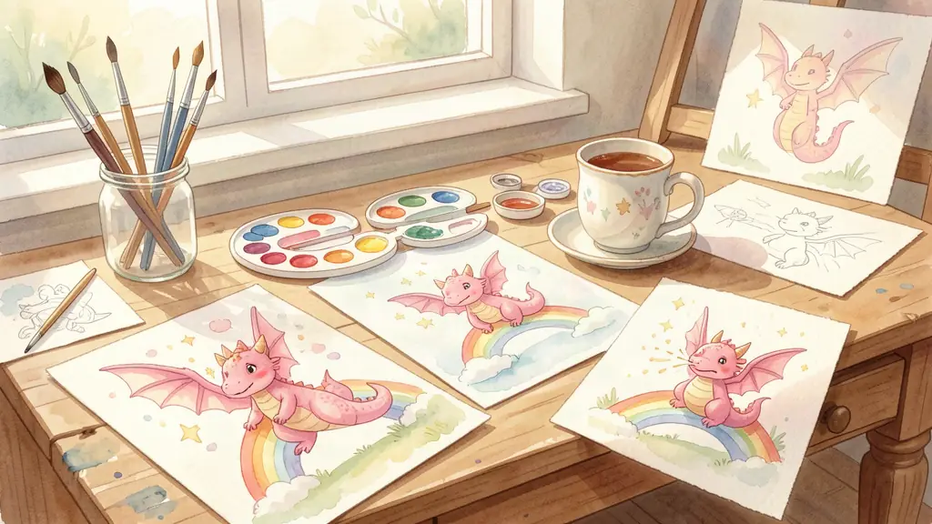
People ask me about the illustrations quite a lot, actually. More than I expected when I started all this. Seeing a picture book makes you want to know how the pictures got there — how a blank page becomes Poppy sitting on a cloud, or peering into a rainbow, or sneezing glitter all over her poor unsuspecting friends.
So I thought I'd walk you through it. Not the polished version, either. The real one, where things go wrong and I end up with muddy puddles where a sunset should be.
It starts with a terrible sketch
Every illustration in the Poppy books begins with a pencil drawing that I'd be embarrassed to show most people. They're rough. Loose. Sometimes Poppy looks more like a potato with wings than a dragon. But that's the point — at this stage I'm working out the composition, where the text will sit, and whether the emotion of the scene actually comes through. If the rough sketch doesn't make me feel something, a polished version won't either.
For Colours of the Rainbow, I did dozens of these roughs for the spread where Poppy discovers the red section of the rainbow. I knew I wanted her face to show genuine surprise, the kind a toddler gets when you pull a funny face. Getting that expression right in a dragon took a lot more tries than I'd care to admit. Dragons don't have human eyebrows, so all the emotion has to come from the angle of the head, the shape of the eyes, and the position of those little horn-ears she has.
Transferring to watercolour paper
Once I'm happy with a sketch, I transfer it to watercolour paper using a lightbox. The paper matters enormously. I use 300gsm cold-pressed paper, which has a lovely texture that grabs the paint in interesting ways. Cheap watercolour paper buckles when it gets wet, and then your careful lines end up in the wrong place entirely.
I transfer the drawing lightly with an HB pencil — hard enough to see, soft enough that it disappears under the paint. There's a specific pressure you learn to use. Too hard and the graphite shows through the lighter washes. Too faint and you lose your guide lines halfway through painting, which is deeply annoying when you're mid-brushstroke on something fiddly like Poppy's tail.
The first wash — and why patience matters
Watercolour is backwards compared to most painting. You work from light to dark, and your lightest tones go down first. That first wash is terrifying every single time. You're committing colour to paper with very little control over where it bleeds and how it dries.
I mix my colours on a ceramic palette — never plastic, because the paint pools differently on plastic and you don't get a true sense of the colour. For Poppy's scales, I use a mix of permanent rose and a touch of yellow ochre, which gives that warm pink-coral tone she has. The exact recipe varies depending on the lighting in the scene. Under the rainbow she's brighter. In the evening scenes from Count Along with Poppy, I push the ochre further so she reads as cosier, more settled.
Building up the layers
Layers are where it gets slow. Each layer needs to dry completely before the next one goes down. In winter, that's maybe twenty minutes per layer. In summer, faster, unless it's one of those humid days where everything stays tacky forever.
I work on several illustrations at once, rotating between them while each one dries. My studio table usually has three or four paintings at various stages, along with an unreasonable number of mugs of tea that have gone cold. The tea situation is a genuine occupational hazard. I've lost count of the times I've reached for my brush water and nearly picked up the Earl Grey instead.
The mid-tones come next — the shadows on Poppy's belly, the depth in her wings, the darker petals of whatever flowers she's surrounded by. I use a lot of wet-on-wet technique here, dropping colour into an already damp area and letting it spread naturally. It gives that soft, dreamy quality that I think suits the Poppy books. Everything should feel gentle, even when Poppy is bouncing around causing chaos.
The details that take forever
Once the main painting is done, I add details with a small round brush and sometimes a rigger brush for really fine lines — things like Poppy's whiskers, the veins in leaves, the patterns on butterfly wings. This is the part that takes the most time relative to the space it covers.
In Who Sneezed Glitter, the glitter itself was a challenge. How do you paint something that sparkles on a flat page? I ended up using a combination of small dabs of white gouache (which is opaque, unlike watercolour) and tiny dots of gold ink. The effect works, but it took a lot of experimentation on scrap paper to get right. There's a version of the sneeze scene in a sketchbook somewhere that looks like Poppy got hit by a paintball gun. Not the vibe I was going for.
Scanning and the digital bits
I scan the finished paintings at 600dpi on a flatbed scanner. Most people think I photograph them, but a scanner gives you even lighting across the whole surface, which makes the digital file much easier to work with. The scan never looks quite like the original painting, though. Watercolour has a luminosity on paper that doesn't fully survive the process. I spend a fair bit of time in editing software adjusting the colour balance to get it back as close as I can.
For the counting books, I also do some light digital work at this stage — cleaning up the odd pencil mark that survived, occasionally adjusting the position of a number element so it sits better with the illustration. But I try to keep the digital work minimal. The whole point is that these look hand-painted, because they are.
Why watercolour, specifically?
I get asked this too. Oil paint is richer. Acrylic dries faster. Digital illustration gives you unlimited undo buttons and the ability to tweak things endlessly. So why choose the medium that's hardest to control and most unforgiving of mistakes?
Mostly because children respond to it. There's a warmth and an imperfection to watercolour that feels alive. You can see the grain of the paper. You can see where the paint pooled slightly darker in one corner. It doesn't look manufactured. When I watch small children flip through the Poppy books, they run their fingers over the illustrations. They feel the texture. That wouldn't happen with a digital print that's perfectly smooth.
And honestly, the way watercolour handles light suits Poppy's world. The paint is translucent, so light passes through the layers and bounces back off the white paper underneath. It gives the illustrations a glow that you can't quite fake with other media. Poppy lives in a world full of rainbows and sparkles and warm evening skies, and watercolour captures that naturally.
The mistakes you don't see
For every illustration in the published books, there are at least two or three that didn't make it. A wash that dried with harsh lines. A colour that went muddy when I layered it. Once, I sneezed while painting a delicate branch — actual sneeze, not a Poppy-style glitter sneeze — and put a big splodge right across her face. It's still in my reject pile. I keep meaning to frame it, actually. It's quite funny.
The point is that making picture books is messy. It's not a straight line from idea to finished page. It's a lot of sitting with wet paper, waiting, trying things, fixing mistakes, and occasionally swearing under your breath when the perfect sunset you just painted develops a hard edge because you touched it with a wet brush one second too late.
But when it works — when you peel the masking tape off the edges and the painting underneath has that soft glow you were hoping for — you remember why you do this. Back to the watercolour table, tea gone cold, fingers slightly stained with paint.
Poppy would approve, I think. She's not a tidy dragon either.